I’ve been some kind of research assistant for a few years now, so I’ve learned a trick or two about making graphs in Excel. However, I’ve had a lot of trouble trying to figure out how to graph two independent sample means and their differences each with 95% confidence intervals. In the spirit of my last few blogs on the shift from using means and p-values (i.e., NHST) to using point estimates, confidence intervals and effect sizes (ESCI), I want to try to use the same data to make a graph from each approach.
I’ll use data from, “an experiment to test whether directed reading activities in the classroom help elementary school students improve aspects of their reading ability. A treatment class of 21 third-grade students participated in these activities for eight weeks, and a control class of 23 third-graders followed the same curriculum without the activities. After the eight-week period, students in both classes took a Degree of Reading Power (DRP) test which measures the aspects of reading ability that the treatment is designed to improve.” I obtained these data from the Data and Story Library. I expect the treatment group to score higher on the DRP than the control group.
NHST:
Results of a one-tailed, independent samples t-test with Welch correction for unequal variances reveal that students in the treatment group (M=51.5, SD=11.0) scored significantly higher, t(37)=2.01, p<0.01, on the Degree of Reading Power test than students in the control group (M=41.5, SD=17.1).
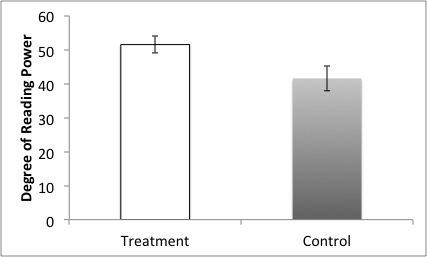
Figure 1. Mean scores on Degree of Reading Power (DRP) by group. Error bars represent 68% confidence intervals by convention because it looks nicer.
ESCI:
I found a 9.95 [1.1, 18.8] point difference, d=0.7, between the scores of those students in the treatment group, 51.5 [46.5, 56.5] and those in the control group, 41.5 [34.1, 48.9].

Figure 2. Means of scores by group and the mean difference between groups on Degree of Reading Power (DRP). Error bars represent 95% confidence intervals so you can actually interpret the accuracy of the means.
So there you have it. This is what could be for the future of psychological science, or close to it. I don’t know about you, but I think that the second report of the results tells me more about what matters in the experiment–how effective is the treatment condition for improving reading power? It appears we can safely conclude that the treatment improves reading power compared to a control group, but the estimate of how much improvement isn’t very accurate. There’s a 20 point spread that includes 1.
In regards to my technical issues, I couldn’t figure out how to place the mean difference data point on the right of the graph next to the secondary axis. If anyone has any suggestions as to how this might be done in Excel, please write in the comments. Thank you.
